
Formfunction
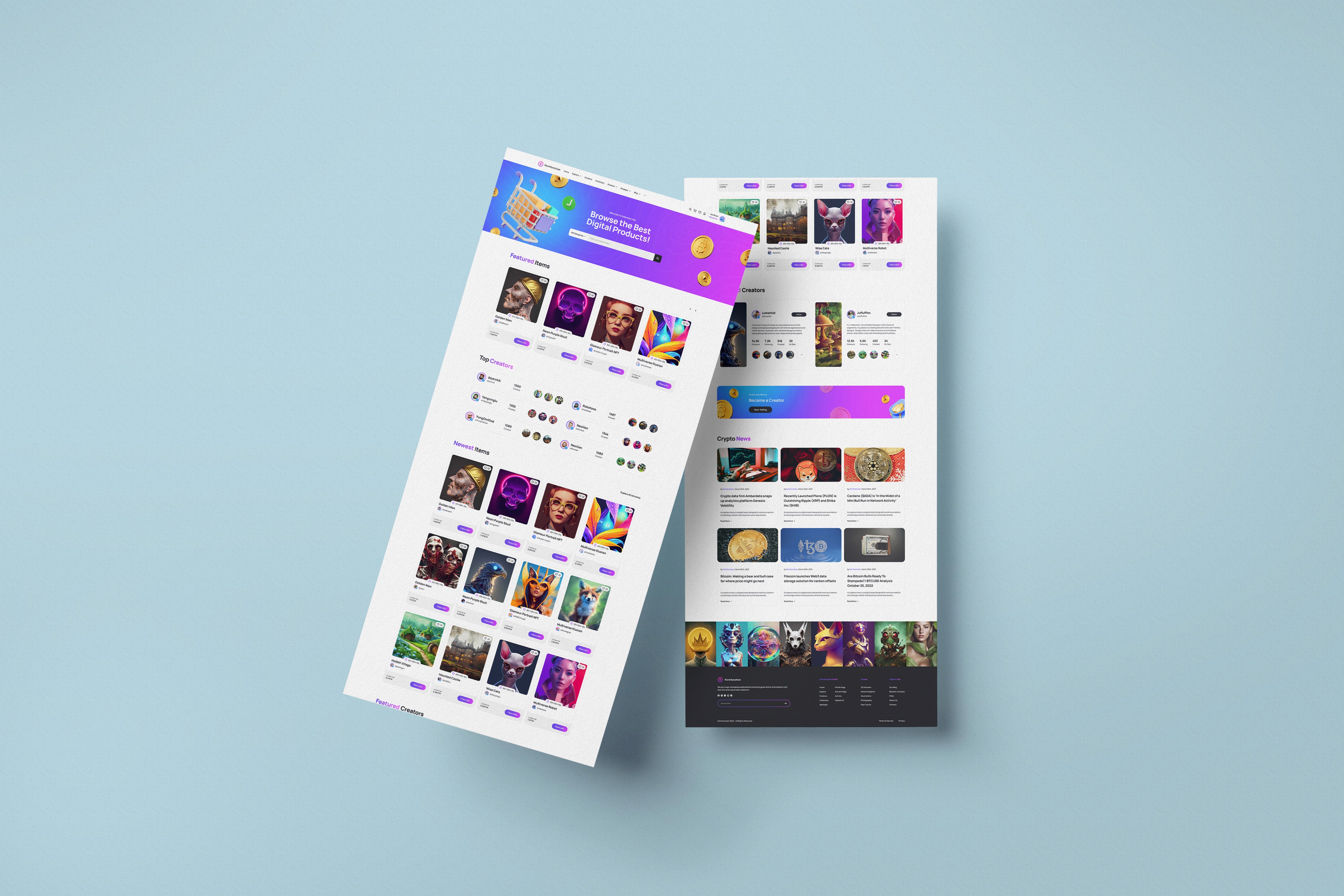
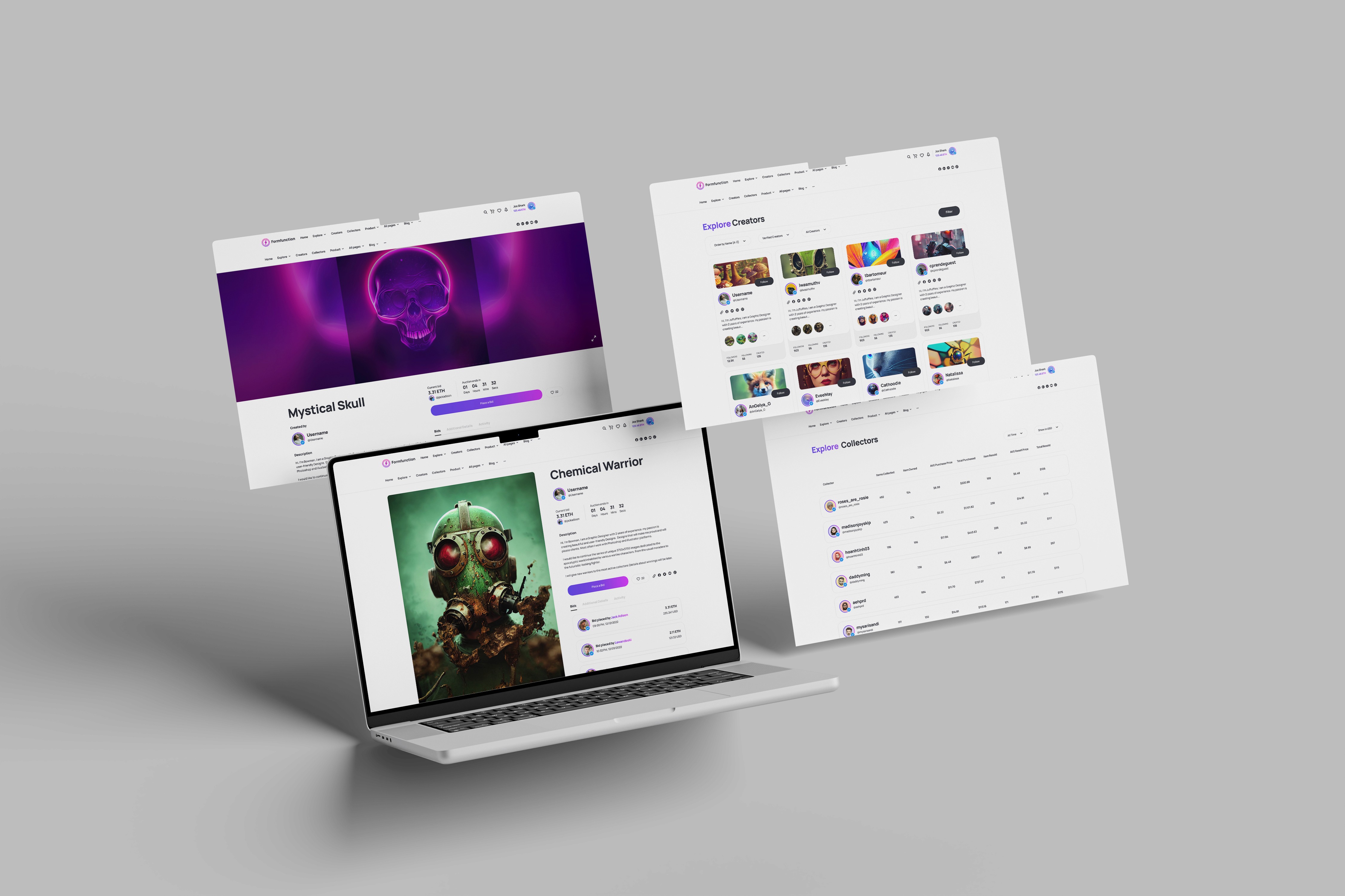
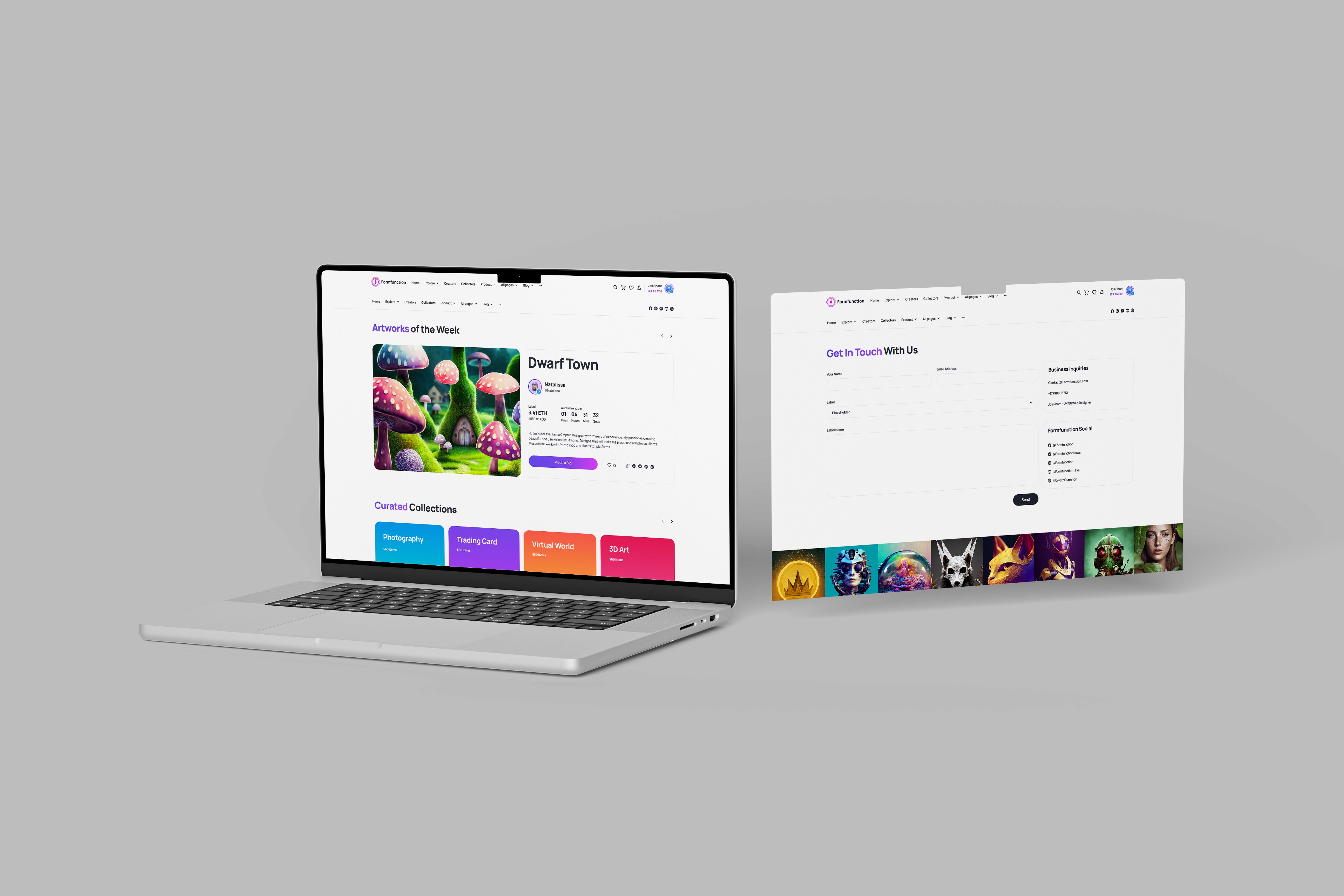
Most NFT platforms looked like stock tickers, so we designed Formfunction to look like a gallery. A minimalist interface that put 1/1 art back in the spotlight.

Year:
2023-2024
Industry:
Web3 / Digital Art
Team:
Product Design Team
Live website:
formfuction

The Problem
The standard NFT experience was broken for creators. It felt like walking into a stock exchange when you wanted to visit a museum. The interfaces were dense, noisy, and obsessed with metadata. Floor prices. Volume ticks. A chaotic ticker tape. For artists selling unique, 1/1 work, this environment was hostile. Their nuanced, singular pieces were fighting for attention against the visual loudness of 10,000-item PFP collections. You can’t appreciate a masterpiece when you’re staring at a spreadsheet. The emotional connection between collector and creator was getting lost in the noise.
Solution
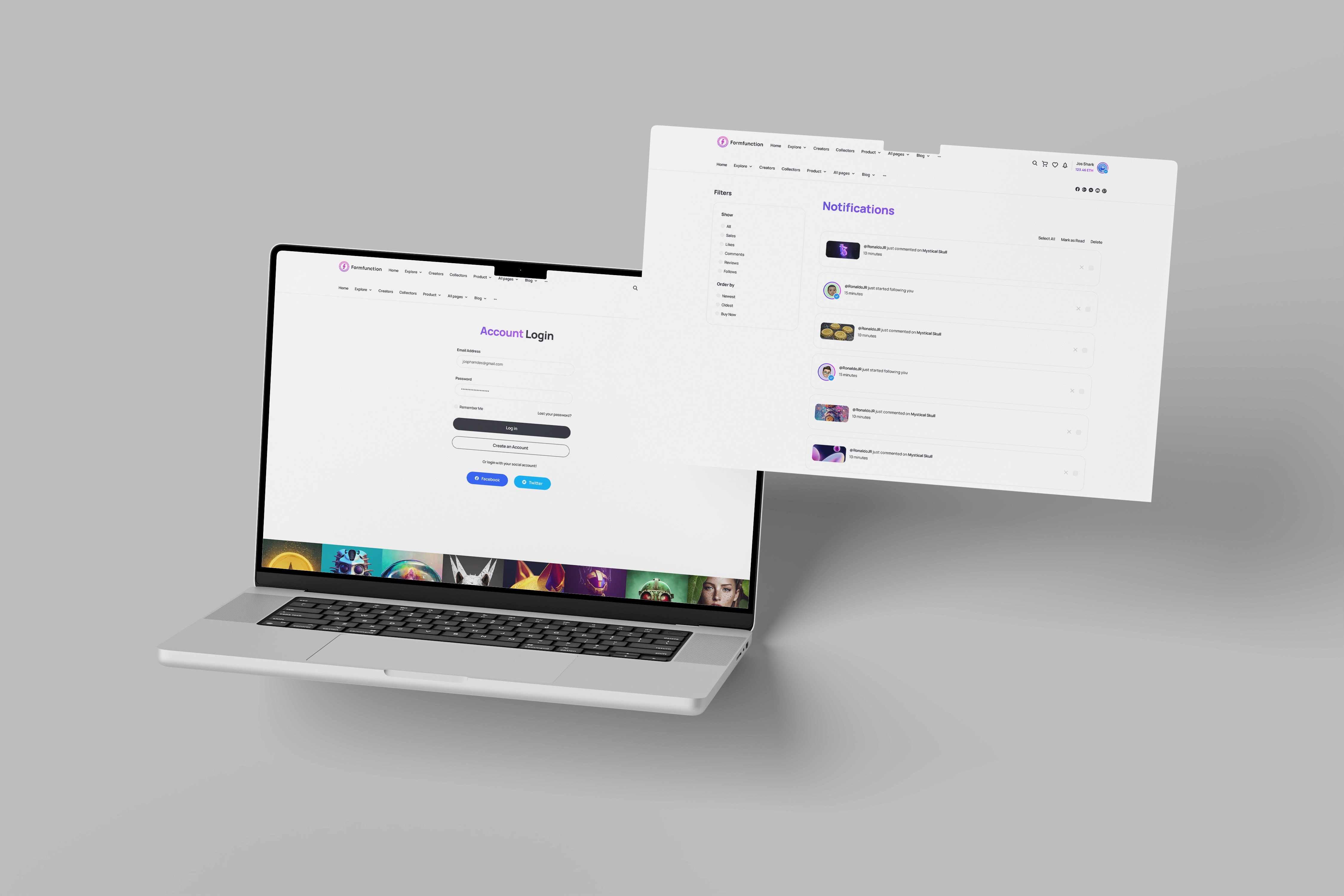
The strategic pivot was simple but radical: subtraction. We stripped away the flashing tickers and the dense rows of trading analytics. Instead, we utilized a "content-first" framework. Heavy white space. Typography that whispers rather than shouts. We treated the screen like a gallery wall where the artwork breathes. By mimicking the spatial elegance of a high-end physical gallery, we shifted the user's mental model from "trader" to "collector. Why this worked: - Framing Effect: By presenting digital assets in a clean, gallery-style context, we implicitly increased their perceived value and artistic merit. - Reduced Cognitive Load: removing the "clutter" of trading data reduced decision fatigue, allowing users to make decisions based on aesthetics and emotion rather than speculation.
Testimonial

More projects


