M
M
e
e
n
n
u
u
M
M
e
e
n
n
u
u
M
M
e
e
n
n
u
u

Case Study

Case Study

Case Study

Bitfront

Crypto interfaces are notoriously intimidating; we made this one inviting. By swapping the industry-standard "dark mode" for a clean, illustrative aesthetic, we bridged the gap between casual buyers and professional traders.

Year:

2020–2023

Year:

2020–2023

Year:

2020–2023

Industry:

Fintech / Web3

Industry:

Fintech / Web3

Industry:

Fintech / Web3

Team:

UI/UX Strategy & Design

Team:

UI/UX Strategy & Design

Team:

UI/UX Strategy & Design

Live website:

Bitfront.com

Live website:

Bitfront.com

Live website:

Bitfront.com

The Problem

The Problem

The Problem

The industry standard was "expert-only" complexity. We needed to design for the rest of us.

The industry standard was "expert-only" complexity. We needed to design for the rest of us.

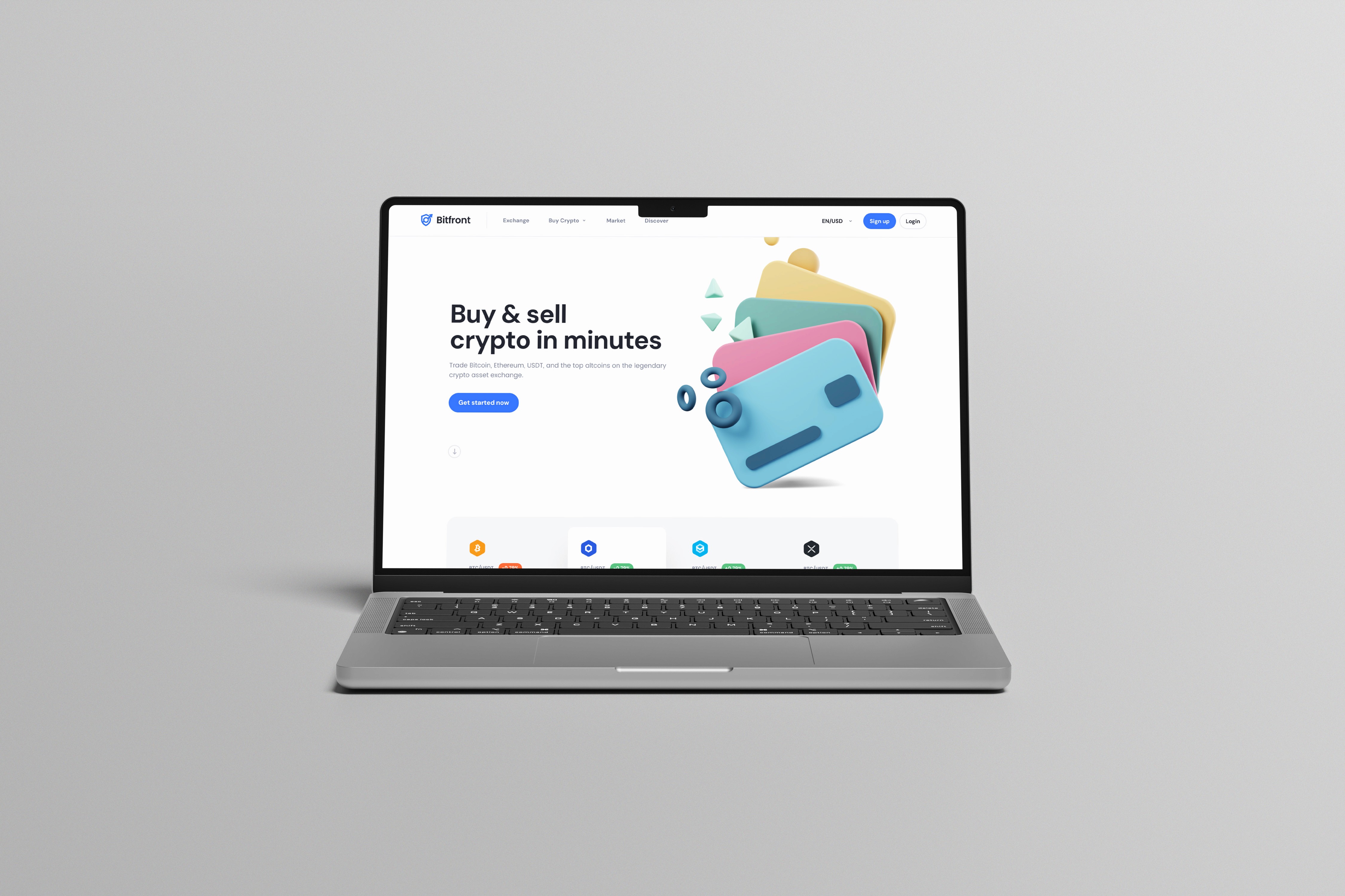
Most crypto exchanges look like the cockpit of a sci-fi spaceship. You have dark backgrounds, neon chart lines, and flashing red tickers that scream danger. For a seasoned trader, that feels like home. But for a retail user trying to make their first transaction? It’s terrifying. The market lacked a middle ground. Users were forced to choose between oversimplified widgets that hid important data, or professional terminals that were impossible to decipher. Bitfront needed to capture the US retail market, and the existing design language was the biggest barrier to entry.

Intimidation

0%

Intimidation

0%

Intimidation

0%

Tiered Experience

2

Tiered Experience

2

Tiered Experience

2

Unified Brand

1

Unified Brand

1

Unified Brand

1

Solution

Solution

Solution

We engineered psychological safety through a "clean slate" aesthetic.

We engineered psychological safety through a "clean slate" aesthetic.

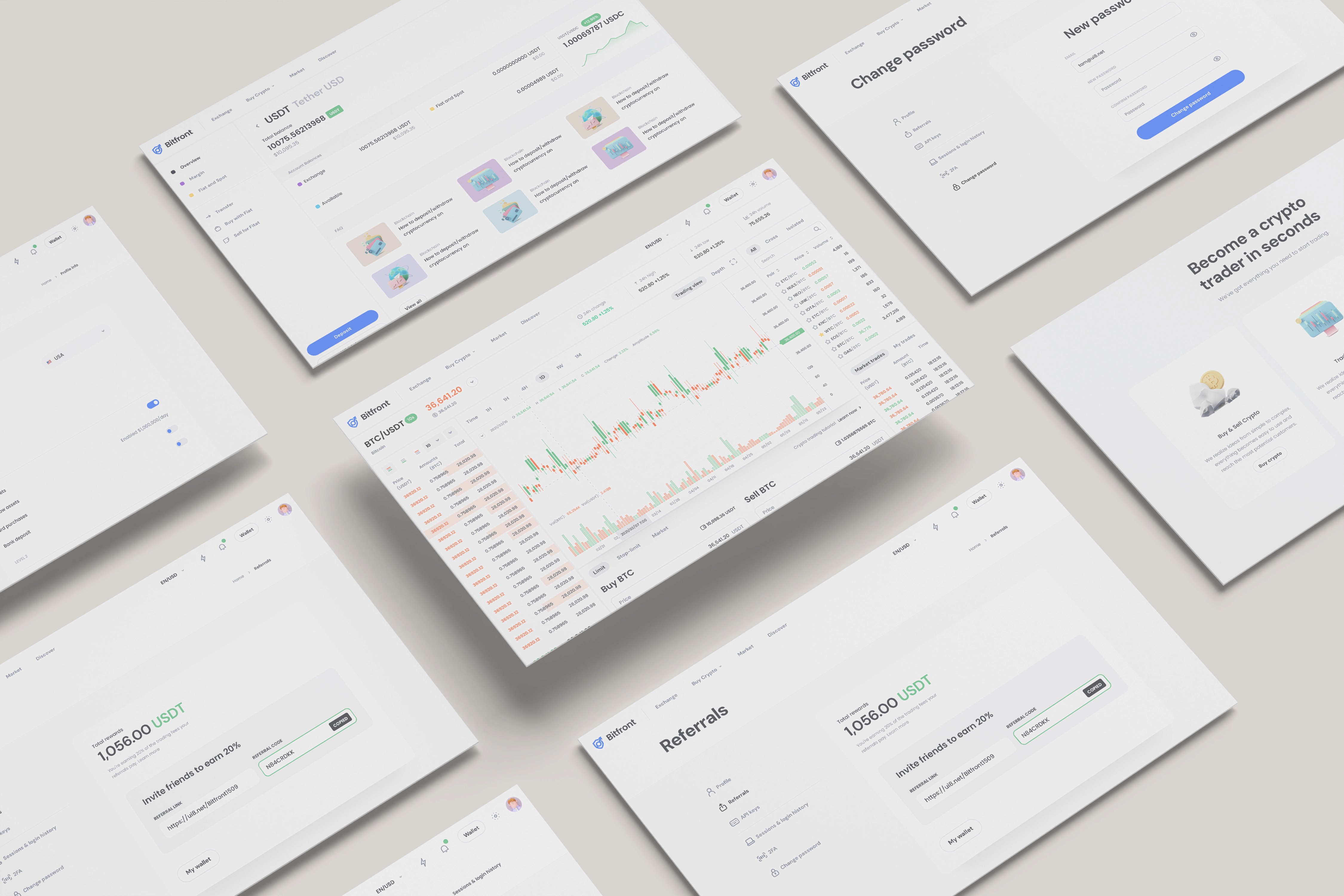
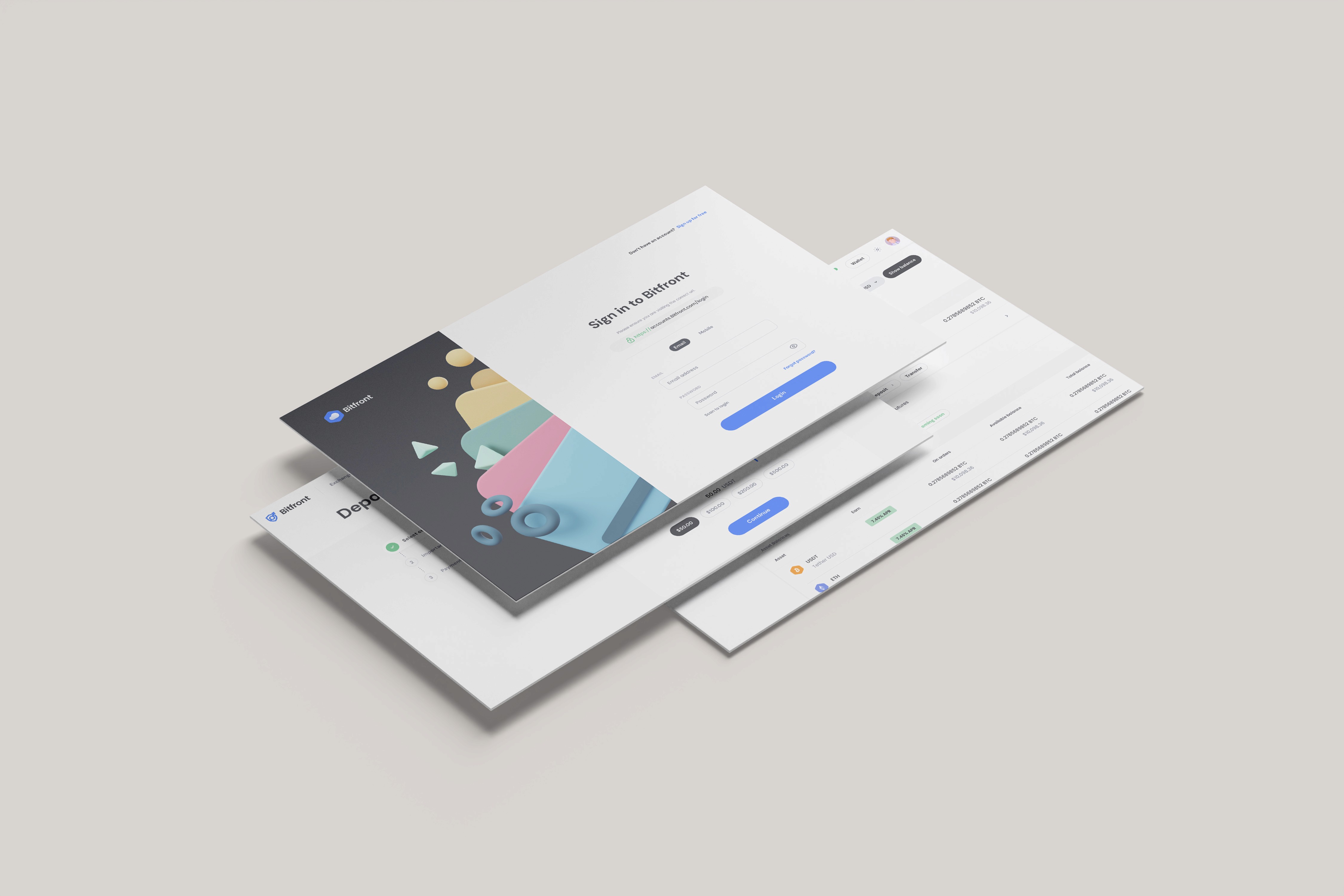
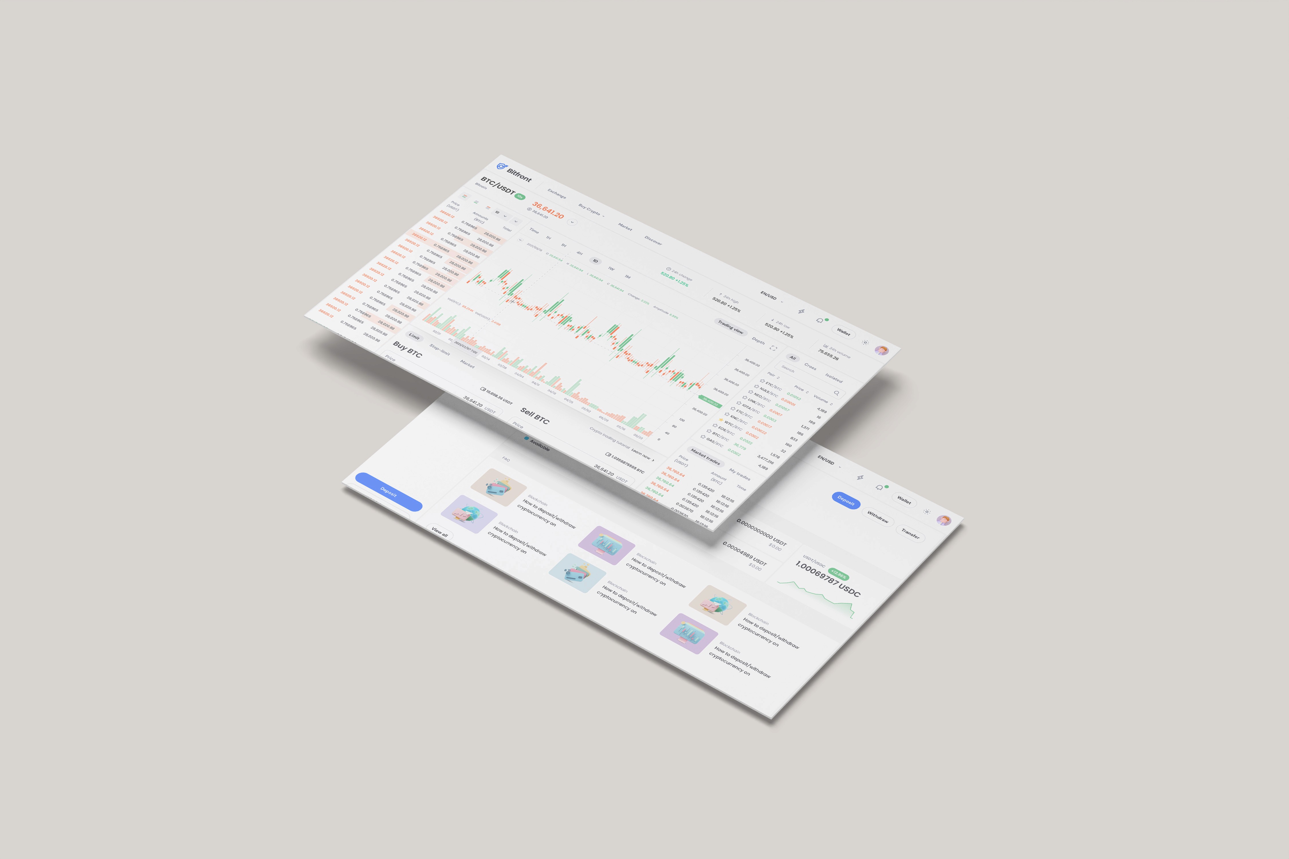
We went in the opposite direction of the market. instead of the brooding, hacker-centric dark mode, we established a bright, white UI system rooted in clarity. We introduced friendly 3D illustrations to soften the technical edges of blockchain technology. This wasn't just decoration. It was a strategic decision to make digital assets feel as safe and manageable as traditional e-commerce. We built a visual bridge—starting users on a friendly "Buy & Sell" widget and gradually introducing the professional trading terminal elements without shifting the visual language. Why this worked: Reduced Cognitive Load: The white space allowed the data to breathe, preventing the "analysis paralysis" common on dark, data-dense screens. Trust Signals: The illustrative style borrowed cues from established fintech apps, signaling stability rather than volatility. Progressive Disclosure: By unifying the aesthetic, users felt comfortable graduating from simple swaps to more complex trading views without feeling like they had changed platforms.

Testimonial

Testimonial

Testimonial

This design successfully demonstrated that a pro-level tool doesn't have to look hostile. It bridged the gap for the retail market perfectly.

This design successfully demonstrated that a pro-level tool doesn't have to look hostile. It bridged the gap for the retail market perfectly.

This design successfully demonstrated that a pro-level tool doesn't have to look hostile. It bridged the gap for the retail market perfectly.

Project Archive

Design Retrospective

Project Archive

Design Retrospective

Project Archive

Design Retrospective

More projects

More projects

More projects

YOUR FIRST STEP

Book a free 30-minute call.

My job is making sure you leave our first call with clarity and next steps.

RUBY RATTEY

CLIENT SUCCESS MANAGER

YOUR FIRST STEP

Book a free 30-minute call.

My job is making sure you leave our first call with clarity and next steps.

RUBY RATTEY

CLIENT SUCCESS MANAGER

YOUR FIRST STEP

Book a free 30-minute call.

My job is making sure you leave our first call with clarity and next steps.

RUBY RATTEY

CLIENT SUCCESS MANAGER

12

Ready to start?

Get in touch

Whether you have questions or just want to explore options, we're here.

By submitting, you agree to our Terms and Privacy Policy.

We are Based in Delhi

+91 96547 30419

B
B
a
a
c
c
k
k
 
 
t
t
o
o
 
 
t
t
o
o
p
p
Soft abstract gradient with white light transitioning into purple, blue, and orange hues